What Colors to Wear for a Studio Photography Session
Planning a studio portrait session is exciting, but one of the biggest questions clients ask before stepping into the studio is: “What colors to wear for a studio photography session?”
Whether you’re booking childhood personality portraits, a studio maternity session, newborn photos, or a family portrait session, color plays a huge role in the final look and feeling of your images.
The truth is, there isn’t one perfect color for every person or every session. The best color for your portrait photography session depends on several factors including your features, the mood you want to create, and where your photos will live in your home.
As a Bellevue portrait photographer, I absolutely love working with color. Some sessions call for bold, vibrant tones while others feel best with soft neutrals or rich earthy shades. The key is choosing colors intentionally so your images feel timeless, cohesive, and personal to your family.
Here are a few things to consider when choosing colors for your next portrait session.
Consider Your Natural Features When picking a Color for your Studio Session
Your skin tone, eye color, and hair color all influence which colors photograph beautifully on you.
Certain tones naturally enhance features and help bring depth and vibrancy into portraits. For example:
- Blue or green tones can beautifully complement blue eyes
- Warm earthy tones often work beautifully with warm skin undertones
- Rich jewel tones can add depth and contrast for darker hair and skin tones
- Soft muted shades can create a delicate, airy look for maternity and newborn portraits
You may have heard of seasonal color analysis — spring, summer, autumn, or winter palettes. While it’s not a strict rule, understanding whether your features lean warm or cool can absolutely help when selecting wardrobe or backdrop colors for your photography session.
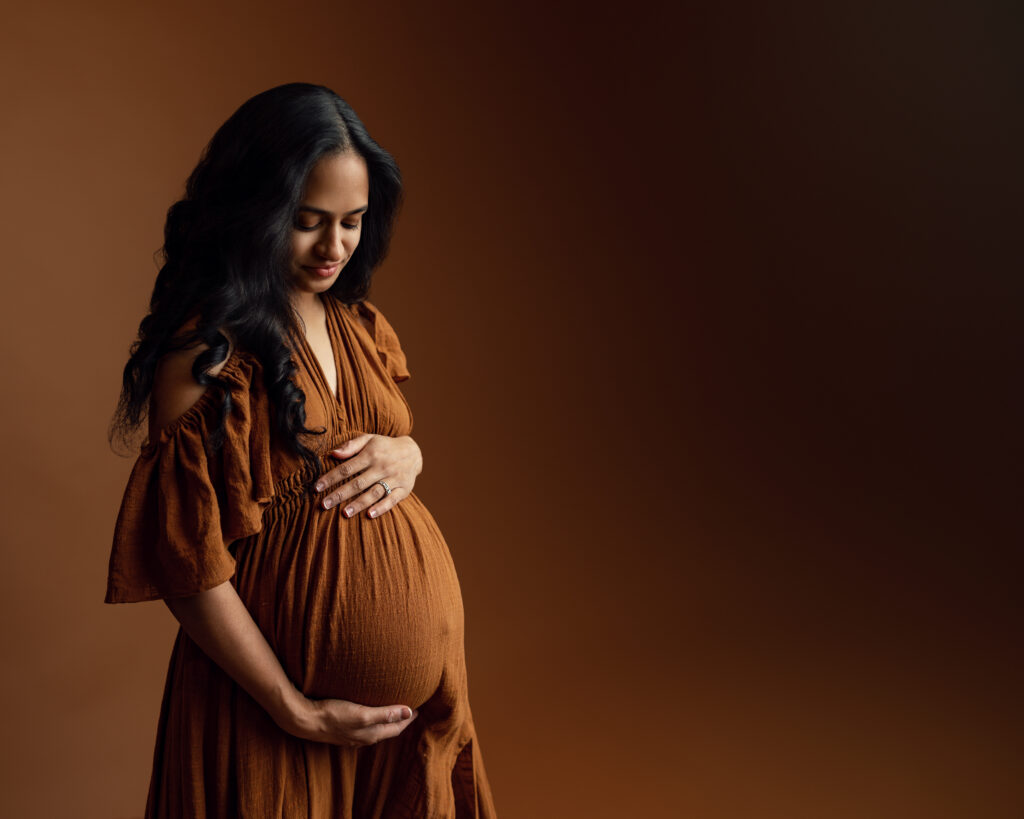
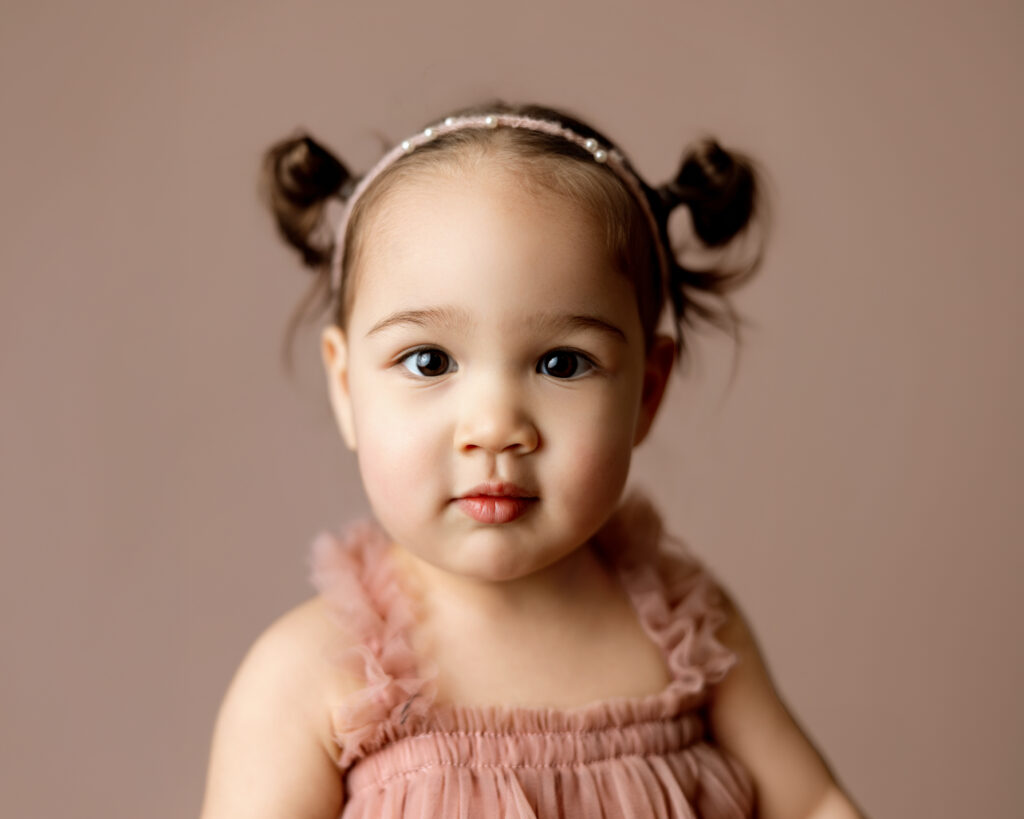
The goal is never to overpower you. The color should support your features and help draw attention to emotion and connection in the image. In the image below both the dress and backdrop beautifully compliment the deep and warm tones of the subject’s skin and hair.
The Mood of Colors in Your Studio Photography Session
Color has a strong emotional impact in photography. What colors to wear for a studio photography session depends on more than just color theory and coordination. It’s about the mood!
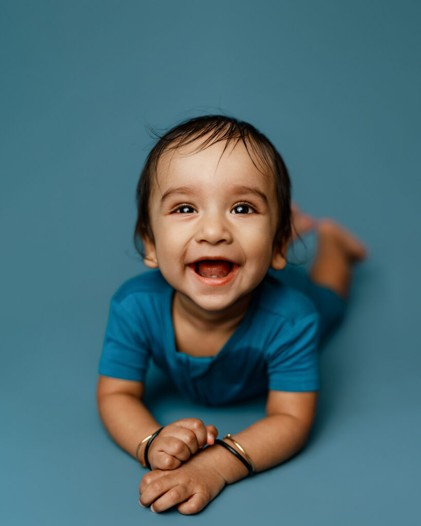
Especially during childhood personality portraits, color can help emphasize who your child is during this season of life. A playful toddler may feel perfect against a cheerful yellow backdrop, while a calm, thoughtful child may shine in deep blues or earthy greens.
When choosing colors, think about how you want the images to feel when you look back on them years from now.
Here are some common emotions associated with different colors:
- Red — passion, energy, excitement
- Pink — softness, warmth, gentleness
- Purple — creativity, richness, elegance
- Blue — peace, calm, trust
- Green — growth, freshness, nature
- Yellow — joy, light, playfulness
- Orange — warmth, friendliness, happiness
- White — simplicity, softness, timelessness
- Black — dramatic, bold, classic
These aren’t hard rules, but leaning into color psychology can create a cohesive emotional feel throughout your gallery.
For more on the psychology of color, you can read this article from Verywell Mind.
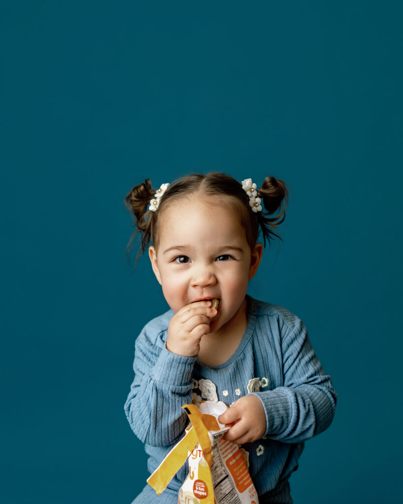
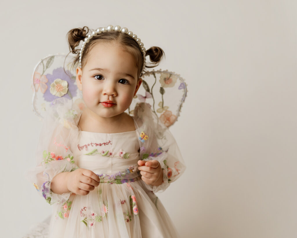
Below you can see how the mood changes for three photos of the same young girl. The blue giving a trusting and childlike glimpse into her comfortable snack time moment. The white offering soft simplicity to her girl fairy dress and innocence of childhood. The pink is a soft and gentle depiction of her bare bones self.
Consider the Colors Where Your Studio Photography Will Be Displayed
One thing many people forget to consider is where the final images will live.
Will your child’s portraits hang in a colorful playroom?
Will your maternity portraits be displayed in your bedroom or nursery?
Are you creating a gallery wall with existing family photos?
The colors you choose for your session can help your artwork flow naturally within your home.
For example:
- Bright playful tones often work beautifully in children’s spaces
- Soft neutrals create a timeless look for bedrooms and nurseries
- Earthy tones pair beautifully with modern organic home décor
- Bold monochromatic color can make a dramatic statement piece
Thinking ahead about wall art and albums helps create portraits that feel intentional long after the session is over.
Coordinate Colors With Past or Future Studio Sessions
If you’re planning multiple portrait sessions over the years, color coordination can create a beautiful sense of continuity throughout your albums and wall galleries.
Maybe each child has their own distinct color palette while still coordinating together.
Maybe your maternity session and newborn session share similar soft neutral tones.
Maybe your yearly childhood portraits slowly evolve through complementary seasonal colors.
You don’t need everything to perfectly match, but thoughtful coordination helps tell a more cohesive visual story over time.
Once You Choose Colors for Your Studio Sesison, Lean Into Them
Once you narrow down what colors to wear to your studio photography session, don’t be afraid to fully embrace them.
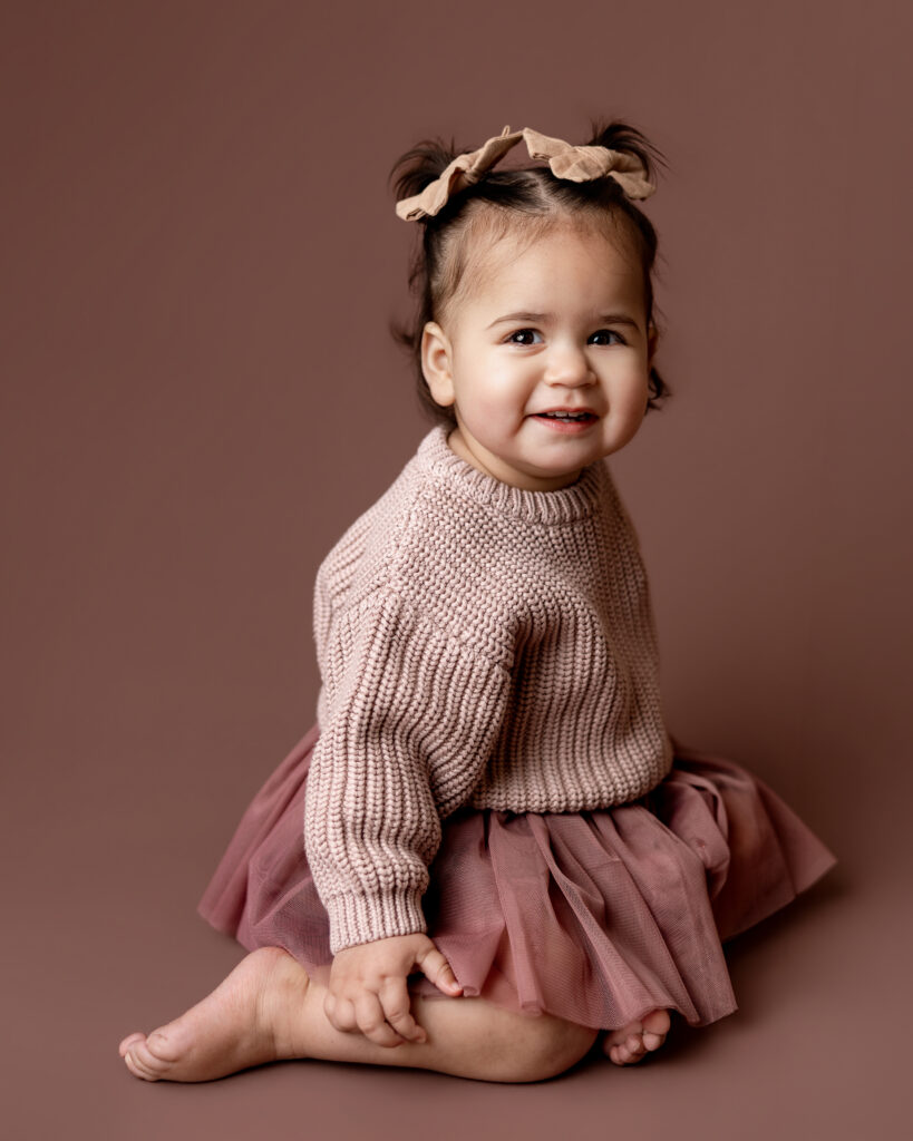
Coordinate wardrobe pieces, favorite toys, bows, blankets, or accessories within the same color family. Monochromatic styling can photograph beautifully in studio portrait sessions because it keeps the focus on expression and emotion while creating a polished final image.
The beauty of studio portraiture is that it strips away distractions and allows childhood, motherhood, and connection to become the centerpiece of the image.
At the end of the day, the “best” color is the one that feels like you.
To book a session for yourself or your child and take full advantage of color in a simplistic way you can book a session with Telly Dez Photography HERE or check out more about my offerings at tellydezphotography.com

